For the long-awaited (by us) new version of the bitcrowd website, our designer Ed created really amazing, vibrant and colorful designs. Our aim was to create a site that represents us and brings some sparks of the joy that the internet was built on. Implementing these complex designs in a performant, cross-browser, accessible, and maintainable way was a challenge, and part of the solution was to make use of the features that SVG offers.


These decorative background images used in our interstitial calls to action seemed like they would make ideal SVGs — flat colors, geometric shapes, and responsiveness. That’s all stuff that SVG is good at!
But…
The initial exports were huuuge
The first time I exported this asset as an SVG from Figma, I got a 2.2MB file. That’s larger than the entirety of the rest of the page, and we need up to five color variations. For an image that we’re using as the decorative background of small intermissions in the content, that’s pretty wild.
The PNG versions of this were each approximately 145kB, giving 700kB for all five color variations. So the PNG was smaller, but an SVG would be a more elegant solution — we could use CSS to create the color variations, it would be resolution-independent, and everything would feel all webby and right. But I needed to get the file size down to something reasonable.
My baseline file sizes were 11MB (2.2MB per theme) for SVGs, and 700kB for PNGs. The PNG couldn’t be much improved; my goal was to reduce the SVG to at least the same size as the PNGs, hopefully further.
Why was the SVG so large?
Looking through the SVG file in my code editor revealed what was taking so much space:
- Repeating textures
- Repeated shapes
The keyword here is “repeated”. In both cases, the solution was to eliminate the repetition.
The flat color fills and simple shapes of Ed’s design are great for SVGs, but the repeating dotted print-like texture not so much. The design app (Figma, but they all do this) had exported each little dot in our “print” texture as an individual path element! 😱 And each of the geometric shapes was a separate new path element.
SVG gives us a few super-useful elements to tackle these problems, which in our case reduced the file size enough to make SVGs smaller than the PNG versions, while still being more flexible. As a bonus, it’s more elegant and easier to maintain, as we now have a single SVG file handling what previously needed a bunch of PNG files that we’d need to re-export when we change something.
The following techniques’ effectiveness is dependent on the images you’re using. You’ll need to try it out in order to see what works for you.
🍇🍒 Low-hanging fruit — remove invisible elements
Your design app may be including elements in the final SVG that aren’t visible, and never will be. The app can’t know how you’ll be using the SVG and is making the right call in leaving them there (I wish that was an option when exporting though). You’ll have to manually remove these elements using your design app.
The original SVG for our decorative image had thousands of <path> elements for dots in the print texture that would never be seen. I started optimizing the SVG by hand in a vector image editor, deleting invisible elements and combining paths wherever I could (with Adobe Illustrator’s “Make compound path” function, but any software like Affinity Designer or Inkscape can do this too).
This might be as far as you need to go. Sadly it didn’t solve my filesize woes — there were still hundreds of visible dots in the image — so I continued.
SVG filesize after removing invisible elements: 1.7MB (340kB per theme)
Avoid repetition with <patterns>s
My first goal was to simplify that enormous print texture.
SVG gives us the <pattern> element for defining repeating patterns. When a pattern is used as a fill for other elements, it’s rendered as repeated tiles filling the element in all directions. For our print texture, that meant that only a few circle <path>s would be needed, instead of thousands of individual circles:
I combined those circles into a single path, then exported it as a tiny SVG. The part I needed was the <path> element from that SVG — I copied it into a pattern element in the <defs> of my SVG file:
<svg xmlns="http://www.w3.org/2000/svg">
  <defs>
    <pattern id="pattern-dots" width="14.4" height="14.4" patternUnits="userSpaceOnUse">
      <path
        d="m5.07 14.14c0-1.1.9-2 2-2s2 .9 2 2-.9 2-2 2-2-.9-2-2zm-7.07-7.07c0-1.1.9-2 2-2s2 .9 2 2-.9 2-2 2-2-.9-2-2zm14.14 0c0-1.1.9-2 2-2s2 .9 2 2-.9 2-2 2-2-.9-2-2zm-7.07-7.07c0-1.1.9-2 2-2s2 .9 2 2-.9 2-2 2-2-.9-2-2z" />
    </pattern>
  </defs>
</svg>
The <pattern> itself has a few attributes:
idso that we can refer to it laterwidthandheightso that the browser knows what size to render the pattern. The values here are the size of the artboard in your design softwarepatternUnits="userSpaceOnUse"this is some SVG magic to specify which coordinate space to use when rendering the pattern
To test whether this worked, I added a <rect> element to my SVG and applied the pattern as a fill using the url helper:
<rect fill="url(#pattern-dots)" width="240" height="120" />
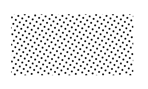
The result was good enough to know this approach would work for the print texture; refinements and optimizations can come later. Time to move on to tackling the other repetition.
Using <symbol>s to avoid repetition
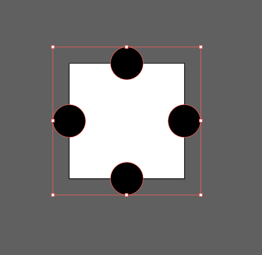
The other repeating elements in the illustrations are the geometric shapes. Some have a color fill and others the print texture, but the shapes are the same.
In your design app, these shapes can be copied to their own artboard and exported to SVG, then copied into our own SVG file like the circles for the print pattern:
<svg xmlns="http://www.w3.org/2000/svg">
  <defs>
    <symbol id="shape-triangle" viewBox="0 0 202 182">
      <path
        d="m77.29 14.65c10.54-18.21 36.89-18.21 47.43 0l72.58 125.38c10.54 18.21-2.63 40.96-23.71 40.96h-145.17c-21.08 0-34.25-22.76-23.71-40.96z"
      />
    </symbol>
  </defs>
</svg>
As with the pattern, the id is there so I could refer to it later. The href attribute expects a URL, no need to use the url helper here:
<use href="#shape-triangle" width="240" height="120" />
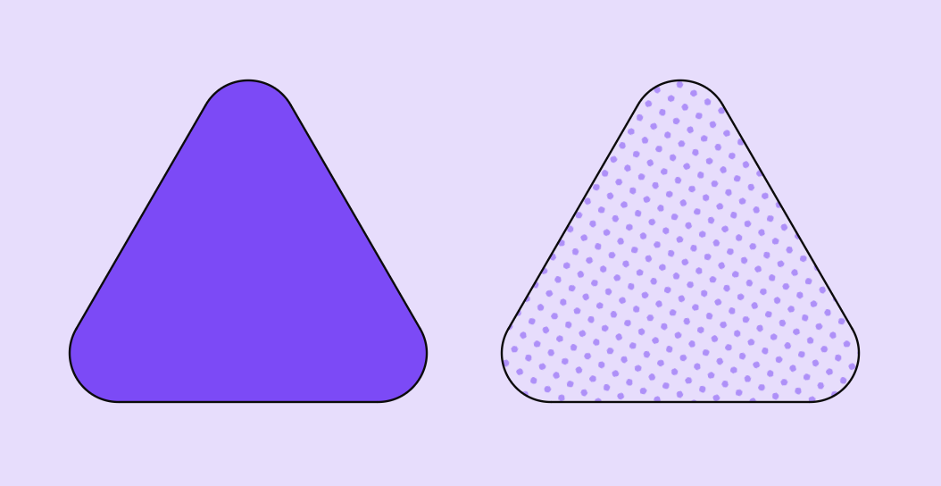
When you use a symbol, you can specify the fill! 🎉 This super-useful feature meant I could give some shapes a color, and others the print pattern:
<use href="#shape-triangle" fill="#f00" width="202" height="182" />
<use href="#shape-triangle" fill="url(#pattern-dots)" width="202" height="182" />
Patterns in patterns
I placed the shapes in pairs and laid them out to match the designs. To get them to repeat, I defined them (of course!) as a pattern.
Here’s a snippet of the result, where I’m using transform to move the pairs of symbols around in the x & y axis. I grabbed the x & y coordinates and rotations directly from the design file and applied them to the elements:
<pattern x="50%" y="0%" width="1408" height="832" id="cta-pattern-green" patternUnits="userSpaceOnUse" patternTransform="rotate(-20) translate(704 0)">
  <g>
    <g>
      <use transform="translate(9 26.5) rotate(105.5)" href="#shape-triangle" fill="var(--bs-small-cta-shape-color)" width="202" height="182" transform-origin="101 91" />
      <use href="#shape-triangle" transform="translate(71.5 57) rotate(15)" fill="url(#pattern-dots)" width="202" height="182" transform-origin="101 91" />
    </g>
    <g transform="translate(288 0)">
      <use transform="translate(81 17) rotate(-15)" href="#shape-square" fill="var(--bs-small-cta-shape-color)" width="162" height="162" transform-origin="81 81" />
      <use href="#shape-square" transform="translate(23 75) rotate(-60)" fill="url(#pattern-dots)" width="162" height="162" transform-origin="81 81" />
    </g>

    // etc
  </g>
</pattern>
Results 📈
After all these optimizations the SVG weighs 59kB, a tiny 0.053% of the original. Even better, since SVG is a text format it’ll be GZIPed on the server, making it even tinier 🎉.
I’m sure this could be optimized even more! There must be a way to use the same pattern for each of our color themes, instead of repeating the pattern like we’re doing right now. I couldn’t get that working across all browsers in time.
But I’m super happy to see these funky and colorful call to action sections on our site — go to bitcrowd.net to see it live.
