At the beginning of 2025, new EU laws for web accessibility will come into force, requiring industries and public bodies to ensure their websites are accessible to all users. This brings up a common question: how can we stick to by accessibility rules while still creating a good-looking product? In this post, we will focus on colour contrast, which is not only one of the simplest and most effective ways to enhance accessibility in design but also one of the most common accessibility fails.

Quick introduction to accessibility
The Web Accessibility Initiative (WAI) defines accessibility as the practice of making websites usable by people of all abilities and disabilities. This means designing and developing digital content that can be easily navigated and understood by everyone, regardless of their hardware, software, language, location, or ability.
What is Colour Contrast and Why It Matters
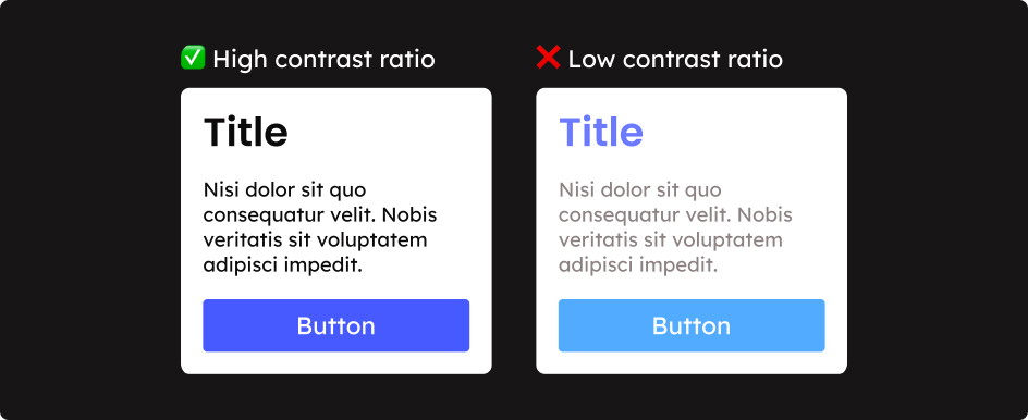
Colour contrast refers to the difference in light between text (or any other foreground element) and its background. High colour contrast improves legibility, which is crucial for users with visual impairments, such as those with low vision or colour blindness.
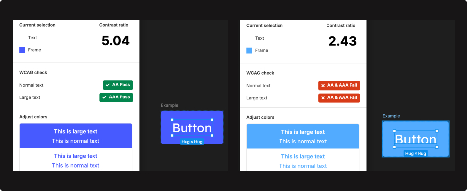
The Web Content Accessibility Guidelines (WCAG) set the (AA level) standards for colour contrast:
- The minimum contrast ratio for regular text is 4.5:1.
- For large-scale text (18 point or 14 point bold), the minimum ratio is 3:1.
You don’t need to memorise these ratios; there are plenty of tools available to help you check and adjust colour contrast, which we will mention later.
So who is this for? Consider that in Europe alone, an average of 1 in 30 people experience sight loss, which means over 30 million individuals. Globally, millions more live with varying degrees of visual impairment. It's important to note that visual impairment exists on a spectrum: It can be permanent, affecting a relatively small number of people. It can be temporary or curable, as in the case of cataracts. And it can even be momentary, such as when someone forgets their glasses or struggles with bright sunlight. Ensuring adequate colour contrast can make a significant difference in the user experience for all these groups.
The advantages of good colour contrast extend beyond this group to benefit the user experience of everyone. Here’s how it helps all your users:
- Legibility: Clear, legible text increases users' ability to absorb information quickly, reducing cognitive load. (This is especially beneficial for users with conditions affecting short-term memory or focus.)
- Trust: Hard-to-read text can make users suspicious as it is reminiscent of the kind of fine print found on dubious products and contracts.
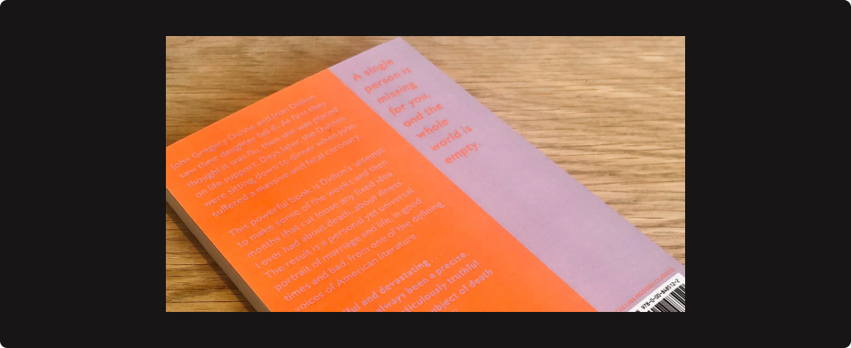
- Bright Conditions: High contrast is crucial for readability in bright environments, a common scenario for mobile users.
- User Retention: Easy-to-read content helps retain users, as they are less likely to become frustrated and leave the site.
- Error Prevention: Using colour contrast effectively can help users distinguish between different types of content and actions, reducing errors.

Accessibility & Aesthetics
Creating accessible designs doesn't mean compromising on aesthetics. In fact, integrating accessibility considerations can enhance the overall beauty and functionality of your design. By thoughtfully incorporating colour contrast and other accessibility principles, you can create visually appealing designs that are inclusive and user-friendly. Here are some practical tips and tools we use to achieve this balance:
- Start Early: Consider contrast ratios during the early wireframing stages. Use appropriate shades of grey (or whatever colour you wireframe with) to distinguish elements.
- Palette Selection: Choose colours that include a dark, mid, and light shade with good contrast against each other. Using these tonal sets can help your colours sing. Tools that help find complementary, analogous, or triadic colour schemes can also be beneficial - Adobe Color.
- Using Colour to Highlight: Even though colour contrast refers to the contrast between any background and foreground elements, text is the key feature that needs to be legible. When a text colour fails a contrast check, consider using it on another element to achieve the same effect.
- Avoid Trends that Hinder Accessibility: While low-contrast, greyed-out text may be trendy, it often compromises readability. When torn between accessibility and aesthetics, there's likely a better solution.
- Keep Checking: Regularly test your designs for contrast at every step and for every design decision. Better to spend a little time doing this early than making changes during implementation. Use plugin tools in your design software such as the Figma plugin Colour contrast or extensions to check within your browser.

Follow Your Eyes as Well as the Numbers
While contrast ratios provide a numerical guideline, it's also important to consider the overall visual comfort, harmony, and emotive effect of your colours. Look at your designs and ensure your colours sit well together without causing visual strain or "vibrating" effects. Do they give off the right impression? Do they make you feel calm? Make you hungry? Research into colour psychology and utilising colour theory can help with this. Tools that implement complementary, analogous, or triadic colour schemes can be a good shortcut for creating aesthetically pleasing and accessible designs.

Conclusion
With the upcoming EU law changes, ensuring colour contrast and accessibility in web design will become a legal requirement for many companies. This shift is ultimately beneficial for everyone, as prioritising accessibility creates more inclusive, user-friendly designs that enhance the experience for all users. The law change will necessitate audits and updates for many companies, but it also offers an opportunity to build trust and improve user satisfaction. Embrace these changes, and you'll be ahead of the curve in creating inclusive, effective digital products.
