
Gone are the days where we built websites & apps by manually copy/pasting colors and sizes from a design file, then again from one part of our codebase to another, making small adjustments to make it fit a little better in this one specific instance. Need a slightly larger margin because of an adjacent border? Adjust it to a new pixel value and you’re good to go! A color should be slightly darker here? Edit the color’s hex code down a little!
The result was magic numbers everywhere in CSS, with no indication of the logic behind the adjustments we made in specific instances. And you can forget about a consistent color palette.
Inconsistency of design can be what gives your UI a humanist and expressive edge. But ideally only when you’ve meticulously planned it.
It’s no surprise that Sass was beloved for bringing order to this chaos. Now that CSS has absorbed all(?) the best parts of Sass’ syntax, and CSS custom properties fill our dev tools inspector to overflowing, what we once called “variables” are now “Design tokens”, and they are (almost always) not variable, thank you very much.
But is it just a name change? With design tokens being the basis of our UIs from design through to development, how do we manage their complexity, and how do we get the most out of them?
Design tokens bring their own brand of chaos
If you let them, the design tokens that promised satisfying clarity will somehow instead bring confusion, duplication, and inconsistency, slowing you down. If you cannot quickly answer the following questions about a design token, you may have issues with design token architecture.
When several design tokens have the same value, which one should I use? This is essentially the same issue as found in any program — just because a variable has the same value as another right now, are they the same? Not when the meaning behind them is different.
Should I add a new design token for this value I’m using right now, or is there an existing token that fits what I’m doing? With a clear system, this is a straightforward question to answer; without a clear system, you’ll either get an ever-increasing set of design tokens that makes answering the previous question even more difficult, or a spaghetti pile of interdependent tokens which you cannot extricate.
Is it clear which design token changes the visual appearance of this specific thing? What about globally changing something’s appearance (changing typographic styles etc.)? Carrying out maintenance, refactoring, or design updates when your design tokens are unclear or complicated is error-prone and time-consuming. The first step is to organise your design tokens.
Structure & hierarchy
What becomes clear when using design tokens is that not all design tokens are created equal. Some are low-level and unchanging, only used to set things up. Others carry meaning or intent and are used everywhere. Yet others have no use outside a very limited scope.
This is the outline of a hierarchy that’s meaningful, and can be used to our advantage when designing and building UIs.
Primary or Basic design tokens
These are the low level design tokens that define your base colors, size scale, font-size scale, and line-heights. The values are raw numbers and hex values.
If a color, space, or font-size doesn’t exist here, then it doesn’t exist in your design system. These tokens will probably only change during a total redesign.
The names here can directly reflect the value, such as red, or a size of 12 , and are often given a value on some scale (red-100, font-size-1) of our own making:
:root {
  --color-purple-1: #2d003d;
  --color-purple-1: #8447ff;
  --color-purple-1: #b48fff;
  --color-purple-1: #e9ddff;
  --color-purple-1: #fbf8ff;

  --spacing-16: 16px;
  --spacing-12: 12px;
  --spacing-10: 10px;
  --spacing-8: 8px;
  --spacing-4: 4px;
}
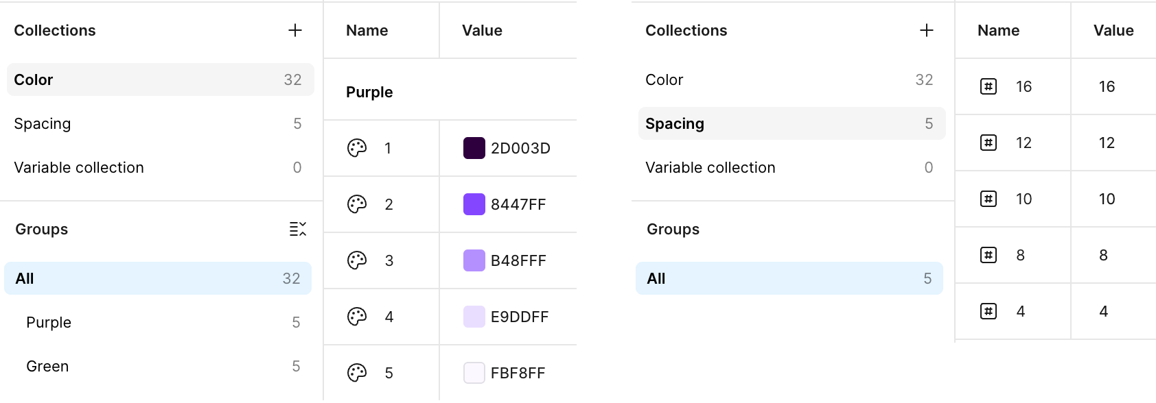
The design tokens in your frontend code should match those used in your designs! This allows a great QA workflow, and makes implementing components simpler and quicker (see my post on getting a speed boost by using design systems). This should be a collaboration between frontend and design teams, to make sure the structure and naming make sense for both.
Secondary or Semantic design tokens
Ideally, the only time you’ll use your primary design tokens is while defining secondary design tokens. Those base, raw values are mapped to a set of meaningful tokens, with names that reflect their intended usage.
In reality that doesn’t apply to the sizing scale for any project I’ve seen (no one wants to redefine their sizing scale while also thinking up a meaningful “semantic” naming system for it).
Most tokens at this level are more straightforward to organise. For example your error color might be red, and your typographic scale will be built from combinations of font-size, line-height, & font-weight. Your border-radiuses may be a small subset of your available size scale.
--color-text: var(--color-neutral-black);
--color-background: var(--color-neutral-white);
--color-error: var(--color-red-3);

--font-size-h1: var(--font-size-4);
--font-weight-h1: var(--font-weight-bolder);
--line-height-h1: var(--line-height-1);

--font-size-h2: var(--font-size-3);
--font-weight-h2: var(--font-weight-light);
--line-height-h2: var(--line-height-2);

--border-radius-small: var(--spacing-4);
--border-radius-large: var(--spacing-16);
The names place the tokens on a scale, and defines what they can be used for.
The scale is of your own making; whatever fits the property they’re used for, such as large and small, or light and regular. Don’t use a name that is tied to the value, like 4 or 16, that’s for the base level.
For example, --spacing-4 could be used for anything. Setting padding, margins, gaps, even font-sizes and line-heights. But --border-radius-small is for border-radiuses, and must never be used to set padding or font-size. Any developer or reviewer who sees font-size: var(--border-radius-small) should quickly realise something is not quite right.
Component design tokens
This last layer is the most focused, and the most selectively-used. There’s no need to define every CSS property of every component using a design token (neither in designs nor in implementation). But for components with multiple variants, this can be a great way to define the set of what can vary between variants.
I find it useful to think of component-level design tokens as defining an API; these are the parameters that you can change for each variant.
For example card components are commonly available in several sizes that visually express the importance of their content.
.card {
  --card-border-radius: var(--border-radius-medium);
  --card-background-color: var(--color-background-contrast);

  border-radius: var(--card-border-radius);
  background-color: var(--card-background-color);
}

.card--secondary {
  --card-border-radius: var(--border-radius-small);
  --card-background-color: var(--color-background);
}

.card--highlight {
  --card-background-color: var(--color-highlight);
}
In the base component class .card, use component-level design tokens to specify the properties that can be changed. In the variant classes, change the design tokens to a new value. Using design tokens for this instead of overwriting CSS properties directly makes your design intention clear, and adds friction to just randomly specifying CSS properties.
In practice
It’s important that each layer references only tokens from the layer immediately below. This enforces the hierarchy, and makes the purpose and scope of each token clear.
A corollary to this is that only the base tokens should have CSS values; the value of a token in other layers is always a token from the layer below.
For smaller projects, you might only need two layers. Architecture and organisation is useful, but there’s no need to over-engineer. Building a small project with design tokens organised into the first two layers of base & semantic tokens gives you many advantages with little overhead. As your project grows, adding a third layer of tokens for your new components is straightforward.
Be sure to share the architecture and naming you create between all stakeholders — designers, developers, and even product. You’ll need to pick a naming scheme and stick to it, to ensure the hierarchy is clear — --button-color-hover or --button-hover-color? — but naming is of course a whole subject of it’s own. Research the possibilities and figure out what works for you.
Good design token architecture is not an implementation detail, it’s our best way to share intent, ensure correctness, and is a vital part of creating a QA feedback loop. Implementing and QAing an implementation is much easier when you minimise the translation needed between the designs and the frontend code.
A 1-to-1 relationship is our goal, with our design tokens being the shared vocabulary between designers & developers. In the structure, naming, and values of our design tokens, we’re building a common language to talk about our components, and creating a record of design decisions.